The Estimates chart
The Energy Chart's Estimates view puts what your solar actually produced next to what SolDial expected for the same period — so one glance tells you whether your system is beating its forecast.
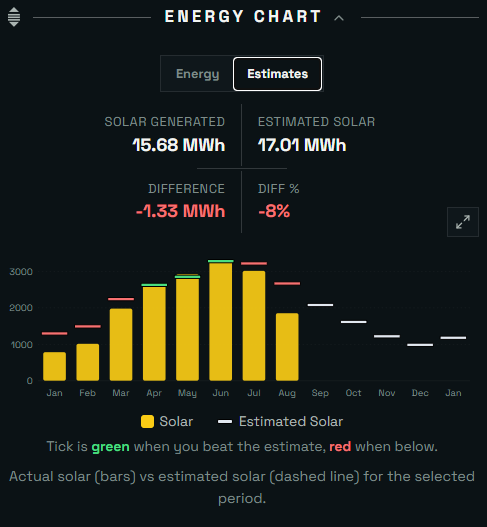
The Estimates tab of the Energy Chart, on the dashboard.
How to read it
The gold bars are your actual solar production; the small dash over each bar is the estimate for that same bucket. The tick turns green when you beat the estimate and red when you came in under it. Buckets follow your time filter — days for a month view, months for a year view.
The summary row above the chart totals the selected period: solar generated, estimated solar, and the difference in energy and percent.
Future periods show the estimate alone
When your selected range extends into the future — the rest of this month, the rest of the year — the chart keeps drawing estimate ticks past today. That's the production SolDial expects for the periods that haven't happened yet, so a year view reads as one continuous picture: what you did, then what's likely coming.
Where the estimate comes from
Estimates come from SolDial's solar forecast model: a physics simulation of your actual roof — each string's size, tilt, and azimuth — calibrated once to your system's own measured history. Past days are rebuilt hour by hour from the weather recorded at your home that day: where the sun was, how much light came straight from it versus from the whole sky, how that lands on each roof face, how hot the panels ran, and whether snow was sitting on them. Future periods use typical conditions for your location. The full method is on the Solar forecasts & calibration page.
Because each past day is modeled from its own weather, a cloudy week doesn't read as a shortfall: the estimate drops with the sun. A single day can still miss when the weather data can't see what happened on your roof — a storm cell over your street, heavy haze, snow that lingers through a long freeze. What's worth a closer look is a gap that holds in one direction week after week; that pattern can point to shading, soiling, or a string producing less than it should.